CharnelHouse Branding
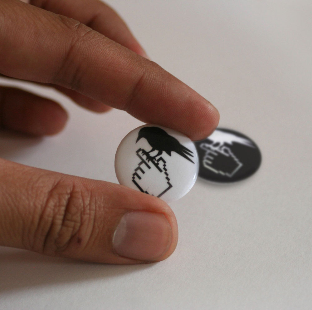
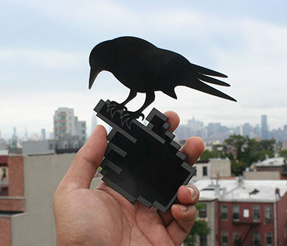
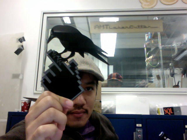
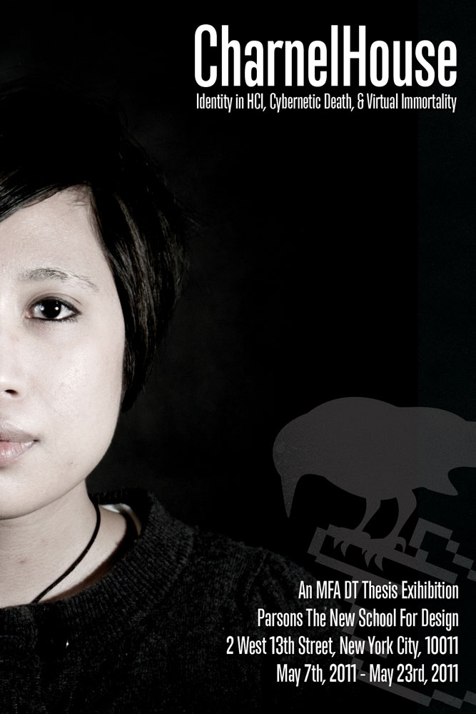
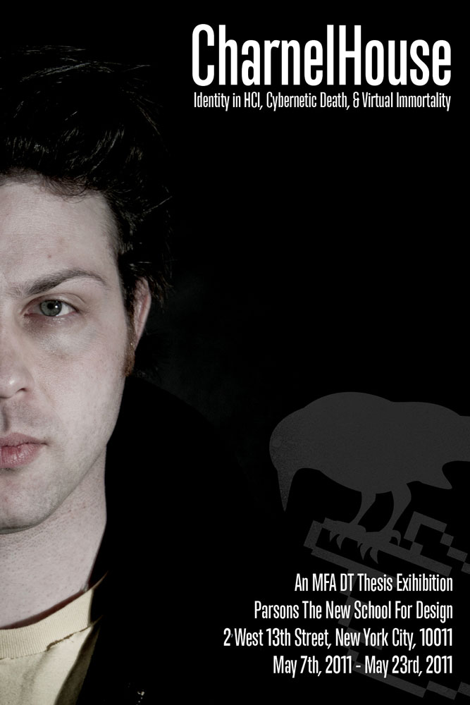
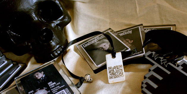
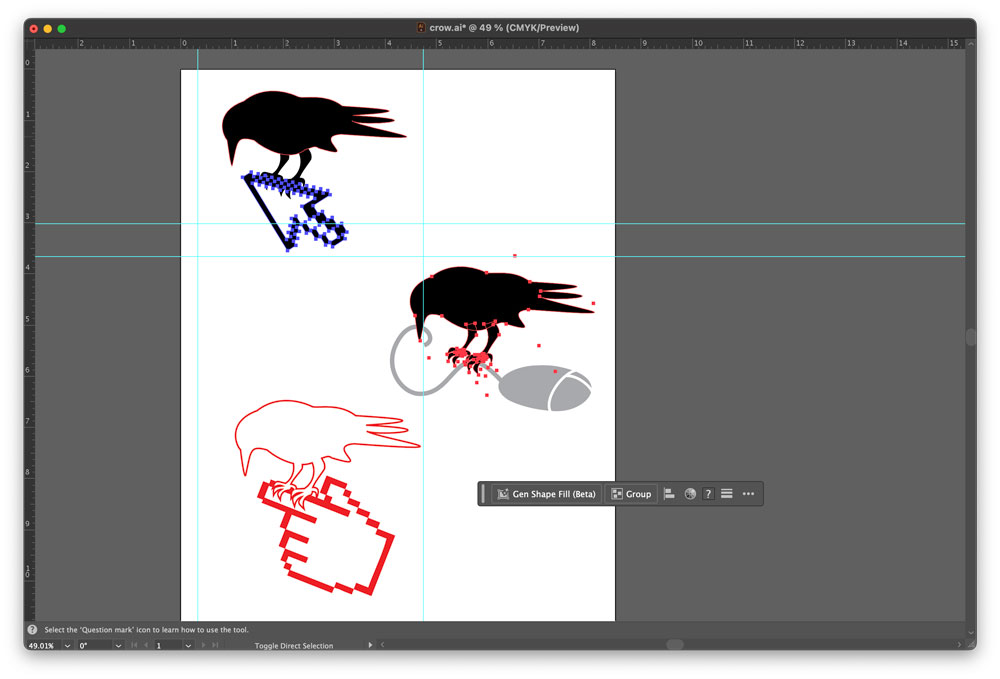
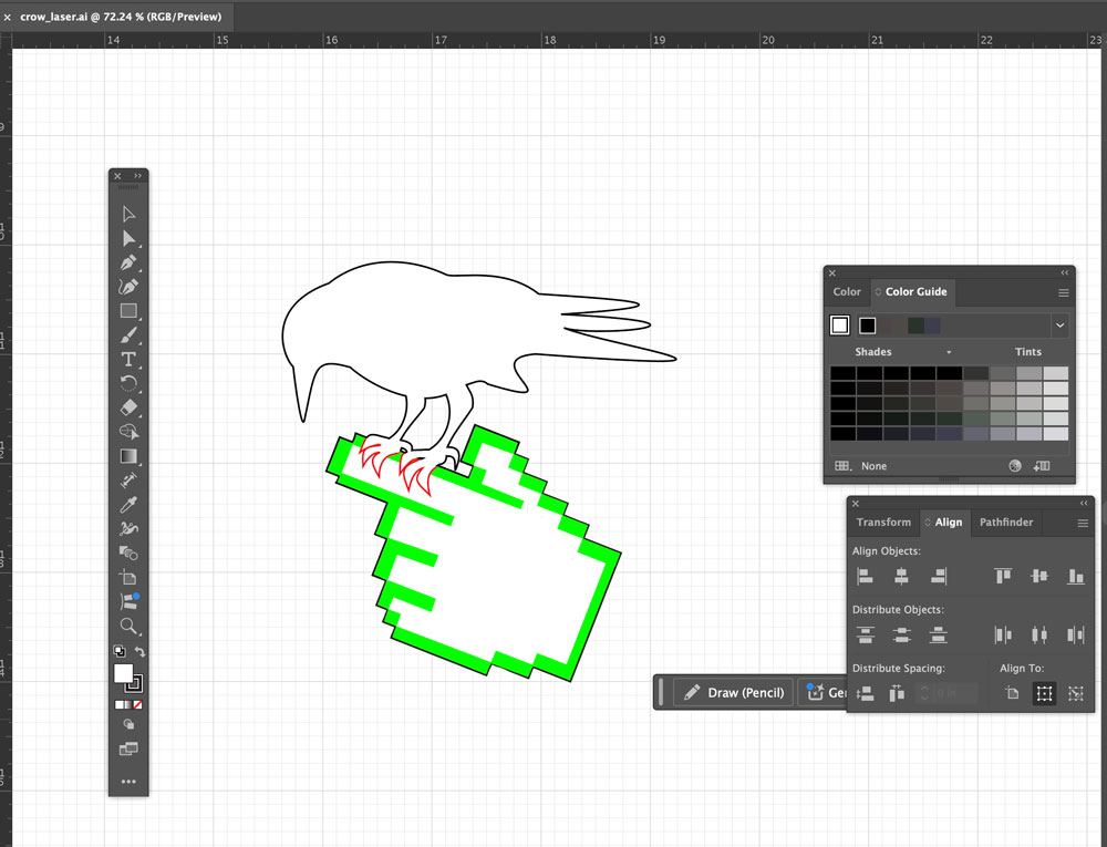
I decided to brand my thesis by creating a logo: a combination of a crow (often an image associated with death and thus “CharnelHouse”) and the traditional, pixelated hand used in Facebook pokes. Using laser-cut elements, postcards, and buttons, I was able to subsequently create a strong promotional campaign.
Client
Parsons the New School for Design
Medium
Illustrator, Photoshop, Laser Cutter, Acrylic Panels, Whale Bone, Wood, Button Press
Related Projects


